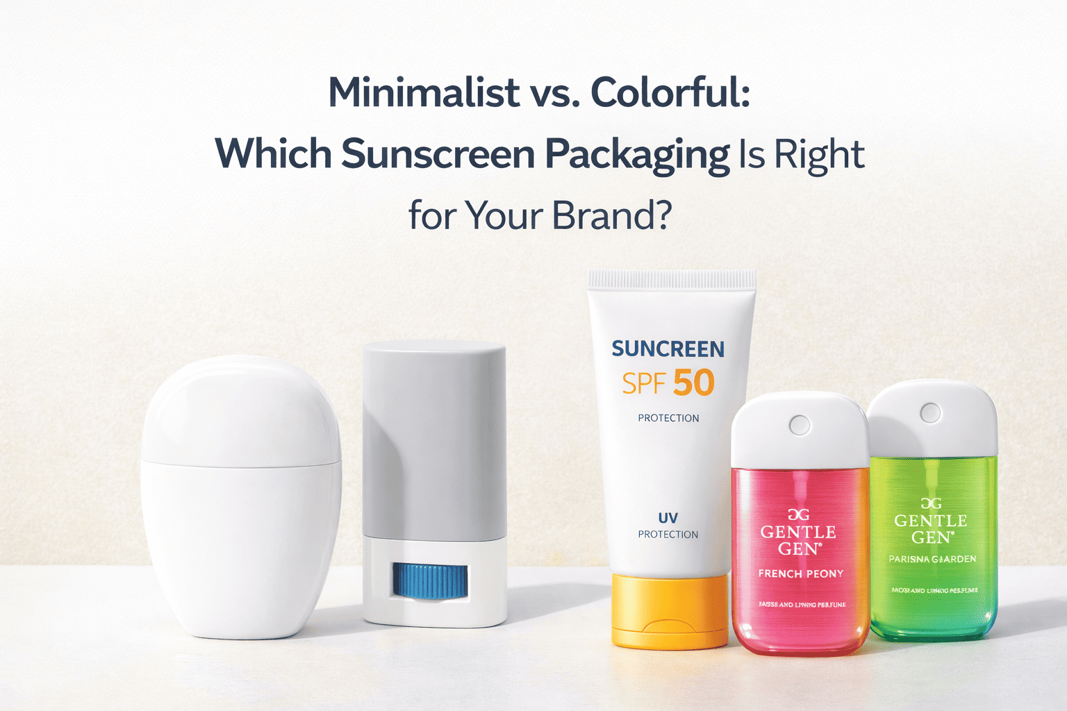
Minimalist vs. Colorful: Which Sunscreen Packaging Is Right for Your Brand?
April 20, 2026 • Mike Lee
Your sunscreen formula is perfect, but it's invisible on the shelf. You see minimalist and colorful trends everywhere but are frozen, unsure which path will actually lead to more sales.
The right choice depends entirely on your target audience, brand positioning, and sales channels. Minimalism builds clinical trust, while color grabs attention. The best strategy aligns the design with these core business goals.
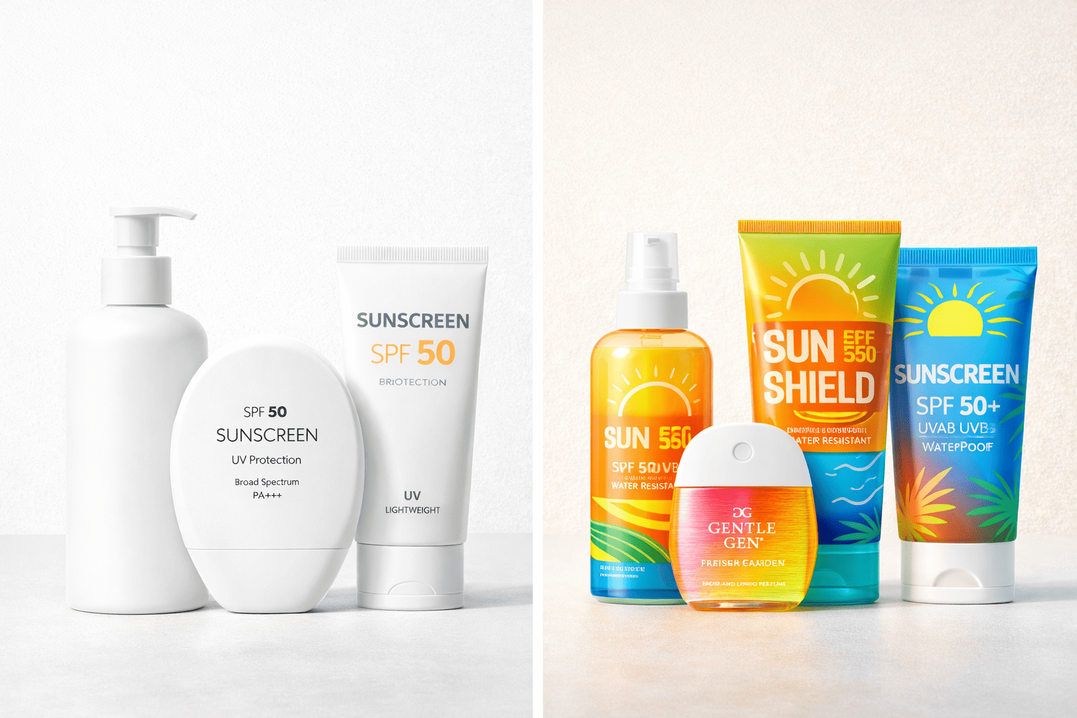
This is a conversation I have with brand managers almost every week. A procurement director like Shubihika, with a premium brand for the Indian market, will naturally lean minimalist to signal quality. On the other hand, a new direct-to-consumer brand targeting Gen Z for beach season will want bright, bold colors that pop on TikTok. There is no single "best" answer, but there is a "best for you" answer. As a manufacturer, I see what works and what doesn't across dozens of brands. Let's break down how to find your perfect fit.
What Makes Minimalist Packaging So Appealing?
You want your brand to scream 'premium' and 'trustworthy'. You're worried a flashy design might look cheap, undermining the high-quality, science-backed formula you have developed inside the bottle.
Minimalism signals professionalism and safety. Its clean lines, neutral colors, and simple typography create a sense of clinical efficacy and luxury, appealing to discerning consumers who prioritize ingredient transparency and quality.
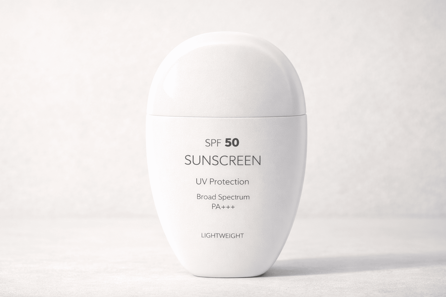
Minimalism is the visual language of trust. When a customer is buying a high-SPF product for their face, they are looking for something that feels safe and effective. Clean, uncluttered design delivers that message instantly. Think about brands sold in dermatology offices or high-end department stores—they almost always use a minimalist approach. From my perspective as a manufacturer, executing minimalism perfectly is deceptively difficult. On a plain white or beige bottle, every tiny flaw is visible. That's why we emphasize the importance of high-quality molds with perfect finishing and a very strict quality control process. A matte or soft-touch finish can elevate this style even further, giving it a tactile sense of luxury. This approach has a long shelf life and works incredibly well in sophisticated markets across Europe, North America, and Japan.
A Minimalist Approach
| Element | Description | Target Customer |
|---|---|---|
| Color Palette | White, beige, light gray, soft pastels | Skincare-focused, 25-45 age range |
| Finishing | Matte, frosted, or soft-touch | Looks for clinical or luxury-grade products |
| Typography | Clean, often sans-serif fonts | Reads labels and values ingredient transparency |
| Brand Image | Professional, trustworthy, clinical, and premium | Buys from dermatologists or premium retailers |
Why Should You Consider Colorful Packaging?
Your product needs to jump off a crowded retail shelf or stop someone from scrolling on their phone. You're afraid a quiet, minimalist design will simply be invisible to your target customer.
Colorful packaging is an attention-grabbing weapon. It uses bold tones, gradients, and playful graphics to create an instant emotional connection, signaling fun, energy, and a lifestyle-oriented brand.
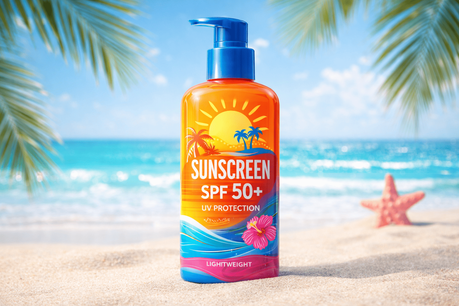
In a busy store or a crowded Amazon search page, visibility is everything. A bright yellow or vibrant turquoise bottle can capture a customer's eye from ten feet away. This is the power of color. It's not about looking cheap; it's about connecting with a different set of values: fun, vacation, energy, and youth. This is the perfect strategy for beach sunscreens, sports lines, or products aimed at kids and families. For brands targeting Gen Z, expressive and bold packaging is practically a requirement. From a production standpoint, achieving this requires different skills. A key challenge we solve for clients is color consistency. We use customized color masterbatches and precise process controls to ensure your signature orange is the exact same vibrant orange in every single production run. This involves more complex printing techniques like multi-pass silk screening or heat transfer printing to get those beautiful gradients and illustrations just right.
A Colorful Approach
| Element | Description | Target Customer |
|---|---|---|
| Color Palette | Bright orange, yellow, blue, pink, gradients | Lifestyle-driven, 18-35 age range, families |
| Finishing | Glossy or high-impact textures | Motivated by fun, trends, and shelf appeal |
| Typography | Bold, playful, or illustrative fonts | Buys for vacation, sports, or everyday fun |
| Brand Image | Energetic, fun, approachable, and modern | Active on social media, shops in mass retail |
Conclusion
Minimalist and colorful packaging are strategic tools. Aligning your design with your target market and brand position is the key to creating packaging that truly sells your product.
Written by

Mike Lee
You may also be interested in:
How Does Packaging Design Really Influence Sunscreen Sales?
You've invested heavily in a superior sunscreen formula, but on a crowded shelf, it gets
Fine Mist Sprayer vs Treatment Pump: Which Works Better for Viscous Formulas?
You've spent months perfecting a new, thicker serum or toner. Now you're stuck. A fine
Why Is Sunscreen Packaging More Challenging Than Skincare Packaging?
You have a great serum in a beautiful bottle and a moisturizer in a premium
How Can You Prevent the Top 5 Sunscreen Packaging Failures?
Your sunscreen launch is at risk from hidden packaging flaws. These issues often appear post-launch,