
How Can Color Psychology Make Your Cosmetic Packaging Sell Itself?
September 12, 2025 • Mike Lee
Your packaging color looks beautiful, but sales are flat. You watch other brands succeed and wonder what you're missing, feeling like your design investment was a total waste.
Color psychology is the key. It uses specific colors to trigger emotions and subconscious associations in your target customer. This allows your product to communicate its core benefit—like luxury, nature, or trust—instantly, driving the decision to buy.
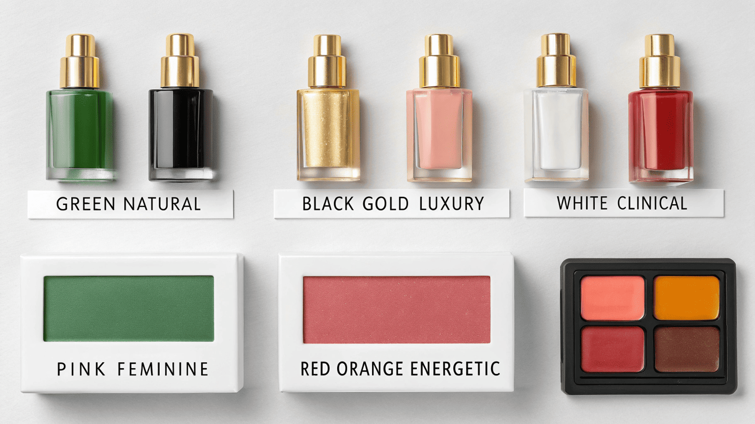
As a ghostwriter and packaging consultant, I see this all the time. A brand owner falls in love with a color, but it sends the wrong message to their ideal customer. The psychology behind your packaging design is really about understanding consumer psychology. When we get the color right, the product doesn't just sit on the shelf; it speaks directly to the shopper. It's one of the most powerful and cost-effective marketing tools you have.
What Is the Psychology of Color in Packaging?
You see color charts linking colors to emotions, but you don't know how to apply them. Choosing your packaging color feels like a random guess, and you fear it won't connect with customers.
It's about strategic signaling. Each color has learned associations. Green signals nature and health, black conveys luxury and sophistication, and white suggests clinical purity. By choosing a color intentionally, you align your product's appearance with the customer's desired outcome.
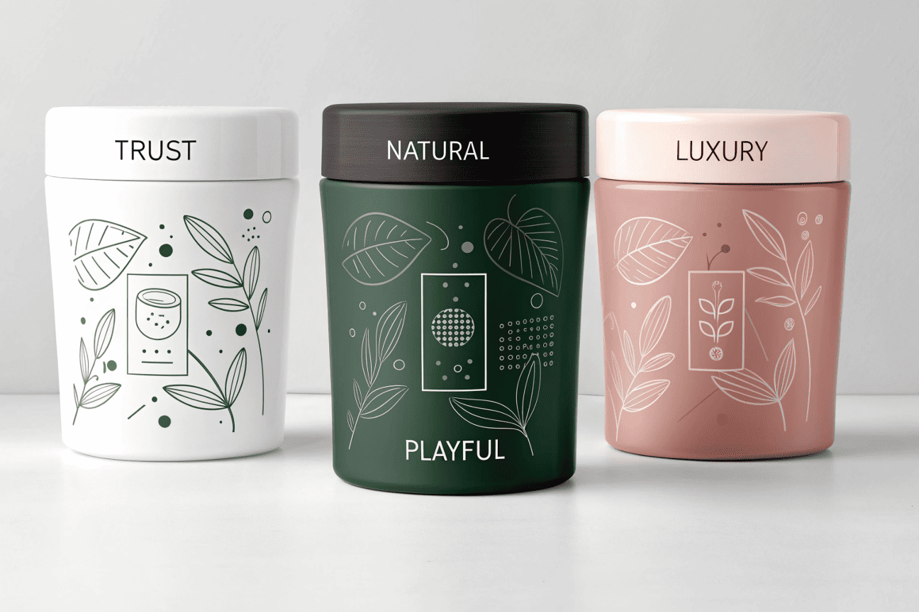
Let's make this practical. When a client comes to me at Rland, we don't just look at pretty colors. We start with the brand's core message and the target customer's mindset. The color is a shortcut to that message.
Think of it like this:
- A clinical anti-aging brand: We'll likely explore whites, silvers, and deep blues. These colors psychologically communicate safety, technology, and seriousness. The customer is looking for a trustworthy solution, and these colors build that trust before they even read the ingredient list.
- A natural, organic skincare line: The obvious choice is green. It's the universal code for "earth" and "plant-based." We also explore earthy tones like terracotta, beige, and soft brown. These colors feel authentic and grounded.
- A bold, youthful makeup brand: This is where we can play with vibrant colors. Bright pinks, electric yellows, and bold reds convey energy, fun, and confidence. The customer is buying an identity, and the color is the first step.
The key insight I always share is that you can also leverage trends. Every year, Pantone announces a "Color of the Year." Incorporating this color or similar tones into your design can make your product feel instantly modern and relevant. It shows customers that your brand is current and in touch with the latest culture.
| Color Family | Psychological Association | Ideal For... |
|---|---|---|
| Greens/Browns | Nature, Health, Calm | Organic, CBD, or "clean" beauty |
| Black/Gold/Silver | Luxury, Power, Sophistication | Premium anti-aging, fragrances |
| Whites/Light Blues | Purity, Simplicity, Clinical | Dermatological brands, minimalist skincare |
| Pinks/Peaches | Femininity, Softness, Youth | Body care, floral-scented products |
| Reds/Oranges | Energy, Passion, Urgency | Bold makeup, stimulating treatments |
What Is the Psychological Impact of Color in Beauty?
You understand color basics, but you wonder how deep the impact really goes. Can a color really change how someone feels about the product inside the bottle?
Absolutely. In beauty, color sets the expectation for the product's performance and sensory experience. A mint green package prepares the user for a cooling sensation, while a soft peach suggests a gentle, pleasant fragrance and texture.
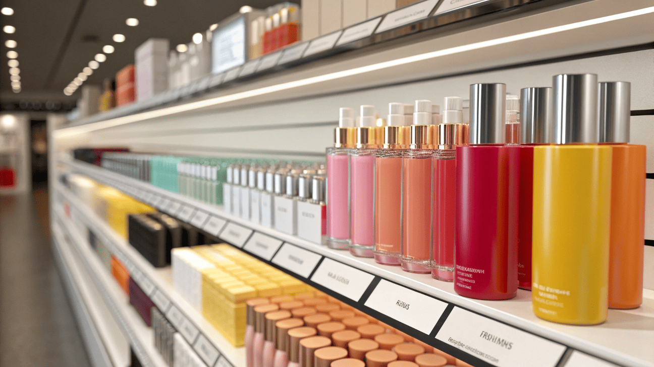
The connection between color and perceived effect is incredibly strong. This goes beyond simple associations and into the user's actual experience. I've seen brands A/B test this, and the results are fascinating. The same formula in two different colored bottles gets perceived differently.
Color and Sensory Expectation
- Texture: A heavy, dark-colored jar can make the cream inside feel richer and more dense. A light, airy-colored tube can make the same cream feel lighter and more whipped.
- Scent: A purple bottle is often associated with lavender, while a yellow one might suggest a citrus scent. The color primes the brain for what it's about to smell, which can enhance the perceived fragrance.
- Efficacy: As we discussed, a white, clinical-looking bottle can make users feel that the product is more potent or "doctor-approved." A product in a playful, bright package might be perceived as fun but less serious in its effects.
When I consult with a brand, we map out the entire user journey. What do you want the customer to feel when they first see the bottle? What about when they pick it up? And what memory do you want the color to trigger when they see it on their bathroom counter every day? The color is doing psychological work at every single one of these touchpoints. It's not just decoration; it's a functional part of the product experience.
What Is the Psychology Behind Packaging Design?
You know color is important, but what about everything else? Shape, texture, and text feel like crucial pieces you're not getting right, making your overall design feel weak.
Packaging design psychology combines color, shape, and typography to create a complete brand personality. A heavy glass jar conveys luxury and permanence, while a sleek, minimalist bottle with sharp lines can feel modern and efficient.
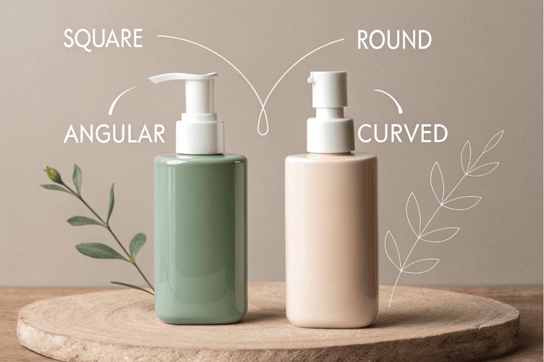
Color is the star, but shape and typography are the supporting cast that makes the whole performance work. Consumer psychology drives every element of packaging.
Shape Psychology
The shape of your bottle is just as important as its color.
- Angular, geometric shapes (squares, sharp-cornered bottles) often feel more masculine, modern, and strong. They communicate structure and precision.
- Rounded, soft shapes (curvy bottles, round jars) are generally perceived as more feminine, gentle, and approachable. They mimic shapes found in nature and feel calming.
I've worked with brands where simply changing from a round bottle to a square one completely transformed their brand perception from "soft and natural" to "clinical and effective." This is why at Rland, our ability to do rapid prototyping with 3D printing is so valuable. Brands can physically hold a square vs. a round bottle and feel the psychological difference themselves.
Typography and Texture
- Font: A classic serif font (like Times New Roman) feels traditional and trustworthy. A clean, sans-serif font (like Helvetica) feels modern and minimalist. A script font can feel personal and elegant.
- Texture: A soft-touch finish feels luxurious and comforting to hold. A high-gloss finish feels sleek and energetic. Even the weight of the package matters—heavier often translates to higher quality in the consumer's mind.
Ultimately, the goal is to make all these elements—color, shape, font, and texture—work together to tell the same story. When they are all aligned, your package has a powerful and cohesive personality that stands out.
Conclusion
Color psychology is your silent salesperson. By strategically using color, shape, and texture, you can communicate your brand's core message, manage customer expectations, and create a product that sells itself.
Written by
Mike Lee
You may also be interested in:
Why Is Sunscreen Packaging More Challenging Than Skincare Packaging?
You have a great serum in a beautiful bottle and a moisturizer in a premium

How Can You Prevent the Top 5 Sunscreen Packaging Failures?
Your sunscreen launch is at risk from hidden packaging flaws. These issues often appear post-launch,
How Do You Choose the Right Spray Output (0.12/0.18/0.25ml) for Your Product?
You're looking at supplier options and see a list of numbers: 0.12ml, 0.18ml, 0.25ml. You
What's the Best 50ml Fine Mist Spray Bottle for a Facial Mist?
Your facial mist formula is perfect, but the wrong spray bottle can deliver a harsh,