
How Do You Choose the Right Typography for Cosmetic Packaging?
November 3, 2025 • Mike Lee
You're trying to choose a font for your new product, and it's overwhelming. A wrong choice can make your brand look cheap or dated, but chasing the latest trend feels like a gamble.
You choose the right typography by focusing on three things: your brand's personality, your target audience, and absolute legibility. The goal is to find a font that is a clear and authentic voice for your product.

I get asked about typography trends all the time. And my honest answer is that specific trends are the wrong thing to focus on. They come and go so quickly. A font that looks modern today can look dated in 18 months. Instead, I always steer our clients toward a more fundamental question: "What is your brand trying to say?" The font is simply the voice you use to say it. A clinical skincare brand needs a clear, precise voice. A luxurious perfume needs an elegant, romantic one. Starting with the message, not the trend, is the only way to choose a font that will last.
Why is typography so important in packaging?
You've spent months perfecting the formula and the package shape. The font on the label can feel like a small, final detail that doesn't carry much weight.
Typography is critical because it is the voice of your brand. It instantly communicates personality—whether you are luxurious, clinical, or natural—and ensures vital information is clear, building both trust and brand recognition.
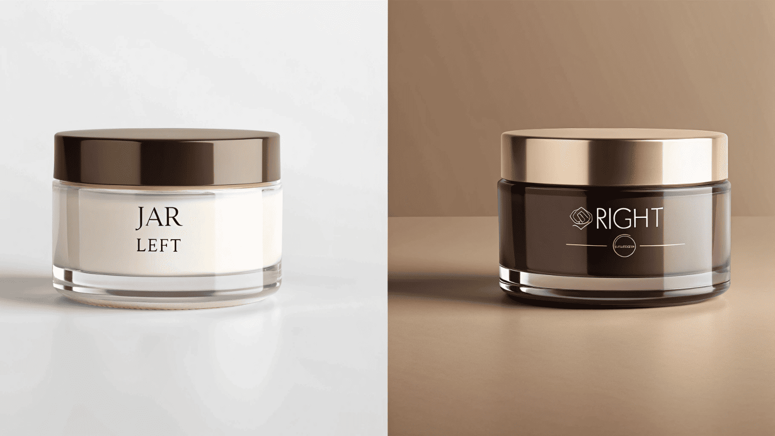
Think of it this way: if your package is the body, the typography is the tone of voice. You can have a great-looking product, but if the "voice" is wrong, the message gets confused. It’s a powerful tool for positioning your brand in the customer's mind before they even read the words. It works on a subconscious level, setting expectations for price, quality, and experience.
| Font Style | Brand Personality It Conveys | Common Use Case |
|---|---|---|
| Elegant Serif (e.g., Didot, Garamond) | Traditional, Luxurious, Trustworthy, Established | High-end anti-aging creams, perfumes, heritage brands. |
| Clean Sans-Serif (e.g., Helvetica, Futura) | Modern, Minimalist, Clinical, Direct, Honest | "Clean beauty" brands, dermatologist-backed skincare, gender-neutral products. |
| Expressive Script (e.g., custom handwritten) | Personal, Artisanal, Natural, Whimsical | Founder-led brands, organic products, limited-edition collections. |
Good typography makes a product feel intentional and high-quality. Bad typography, even on a great package, can make it feel cheap and untrustworthy.
What will the next consumer trend in labeling be?
You want your brand to feel current and relevant. You need to know what's coming next so you can stay ahead of the curve and connect with modern consumers.
The next major trend isn't a single font, but a split into two big movements: "Radical Simplicity" driven by clarity and transparency, and "Expressive Authenticity" driven by unique, personality-filled custom fonts.
Instead of trying to predict the one "hot" font for next season, it's more useful to understand the major cultural shifts that influence design. Right now, the beauty industry is being pulled in two distinct directions, and the typography is reflecting that.
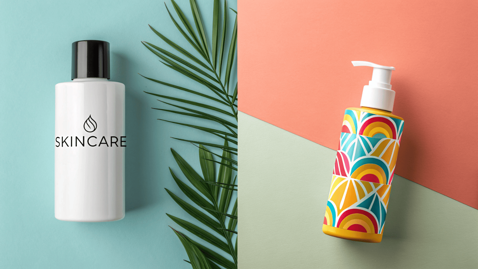
Movement 1: Radical Simplicity & Clarity
This is a direct response to the "clean beauty" and "skintellectual" consumer. These customers want transparency, not fluff. They demand to know the ingredients and what they do.
- Typography Style: Often uses a single, clean, sans-serif font. There's a lot of negative space. The hierarchy is perfect, making ingredients and percentages easy to read.
- Why it Works: It communicates honesty, efficacy, and scientific backing. It feels modern and straightforward.
Movement 2: Expressive Authenticity & Personality
This is a reaction against the sea of minimalist brands. These brands want to stand out with a strong, unique story and a memorable personality.
- Typography Style: Often uses custom-drawn logos, bold retro fonts from the 70s or 90s, or quirky, character-filled serifs.
- Why it Works: It feels unique, confident, and founder-driven. It creates a memorable vibe that builds a cult following.
The "trend" is to choose a side and commit to it fully.
What are the 4 C's of packaging?
You're excited about choosing a font that expresses your brand's personality. But how do you ensure the packaging still does its fundamental job, regardless of the style you choose?
The 4 C's are the functional foundation of all good packaging: Containment (it holds the product), Protection (it survives shipping), Convenience (it's easy to use), and Communication (it's easy to understand).
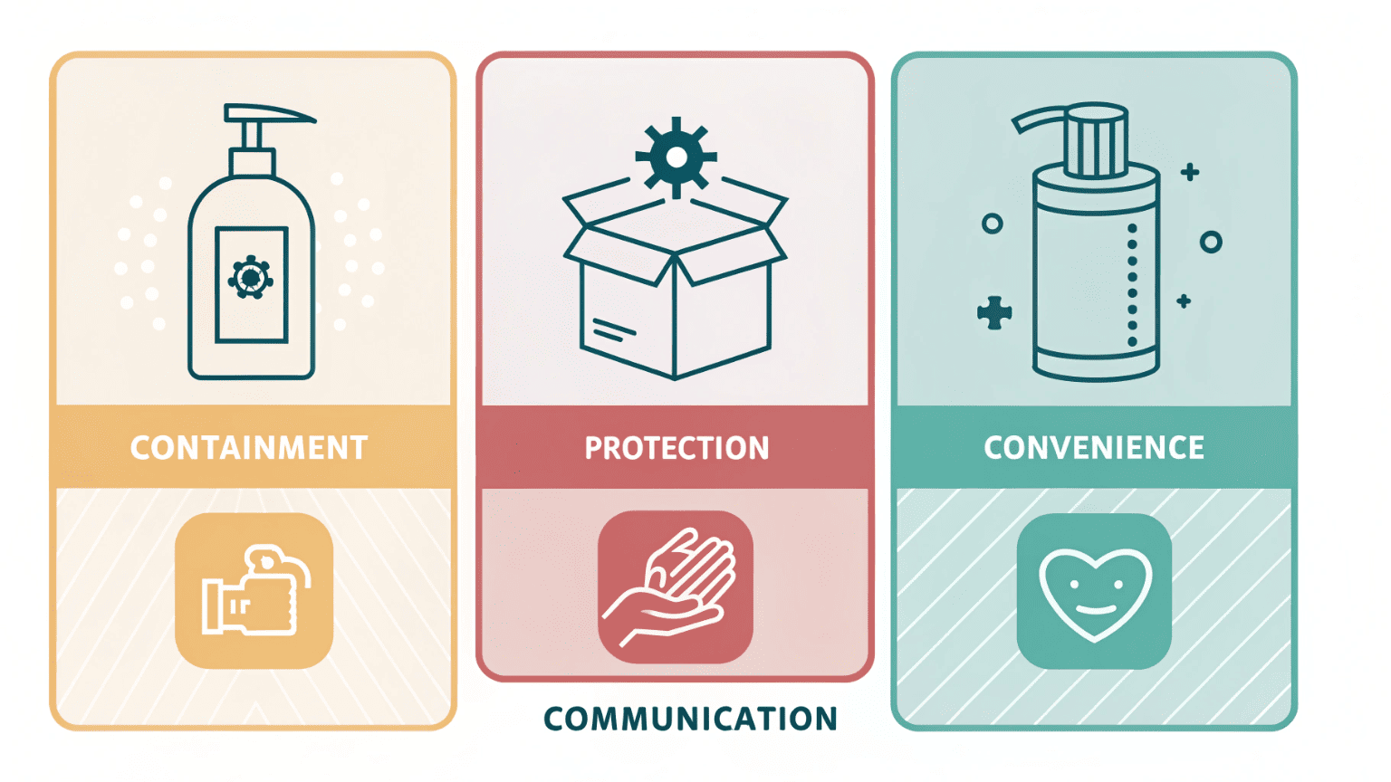
Typography falls directly under the most critical "C": Communication. If your beautiful, trendy font makes the product name, instructions, or ingredient list impossible to read, the design has failed. No matter how creative you get, communication must always come first.
Here's how we apply the 4 C's to typography choices:
- Communication is King: The primary goal of text is to be read. We always test fonts for legibility, especially in smaller sizes required for ingredient lists. We ensure there's enough contrast between the text color and the background.
- Convenience in Reading: Good typography creates a clear hierarchy. The brand name is most prominent, the product name is second, and key benefits are third. This makes it convenient for a customer to scan the label and understand the product in seconds.
- Containment & Protection for the Message: The printing method we use (like silk screening or hot stamping) must be durable. It has to contain the printed message and protect it from smudging or rubbing off during shipping and handling, ensuring the communication remains intact.
A successful design is one where creative expression and clear communication work together perfectly.
Conclusion
Choosing the right font is not about chasing fleeting trends. It's about defining your brand's voice and using typography to communicate it with clarity, confidence, and unwavering consistency.
Written by

Mike Lee
You may also be interested in:
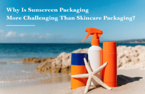
Why Is Sunscreen Packaging More Challenging Than Skincare Packaging?
You have a great serum in a beautiful bottle and a moisturizer in a premium
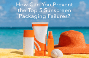
How Can You Prevent the Top 5 Sunscreen Packaging Failures?
Your sunscreen launch is at risk from hidden packaging flaws. These issues often appear post-launch,
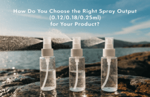
How Do You Choose the Right Spray Output (0.12/0.18/0.25ml) for Your Product?
You're looking at supplier options and see a list of numbers: 0.12ml, 0.18ml, 0.25ml. You
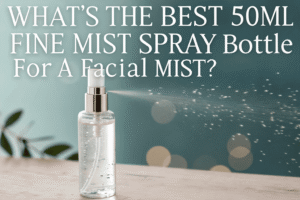
What's the Best 50ml Fine Mist Spray Bottle for a Facial Mist?
Your facial mist formula is perfect, but the wrong spray bottle can deliver a harsh,
