
How Do You Balance Beauty and Function in Cosmetic Packaging?
September 28, 2025 • Mike Lee
Your new package design looks stunning on a computer screen, but in reality, it's difficult to open and the pump dispenses too much product. You feel frustrated, caught between a beautiful vision and a functional failure.
The key to balancing aesthetics and functionality is integrated design, where material choice, user experience, and brand identity are considered simultaneously from the very beginning, not as separate steps.
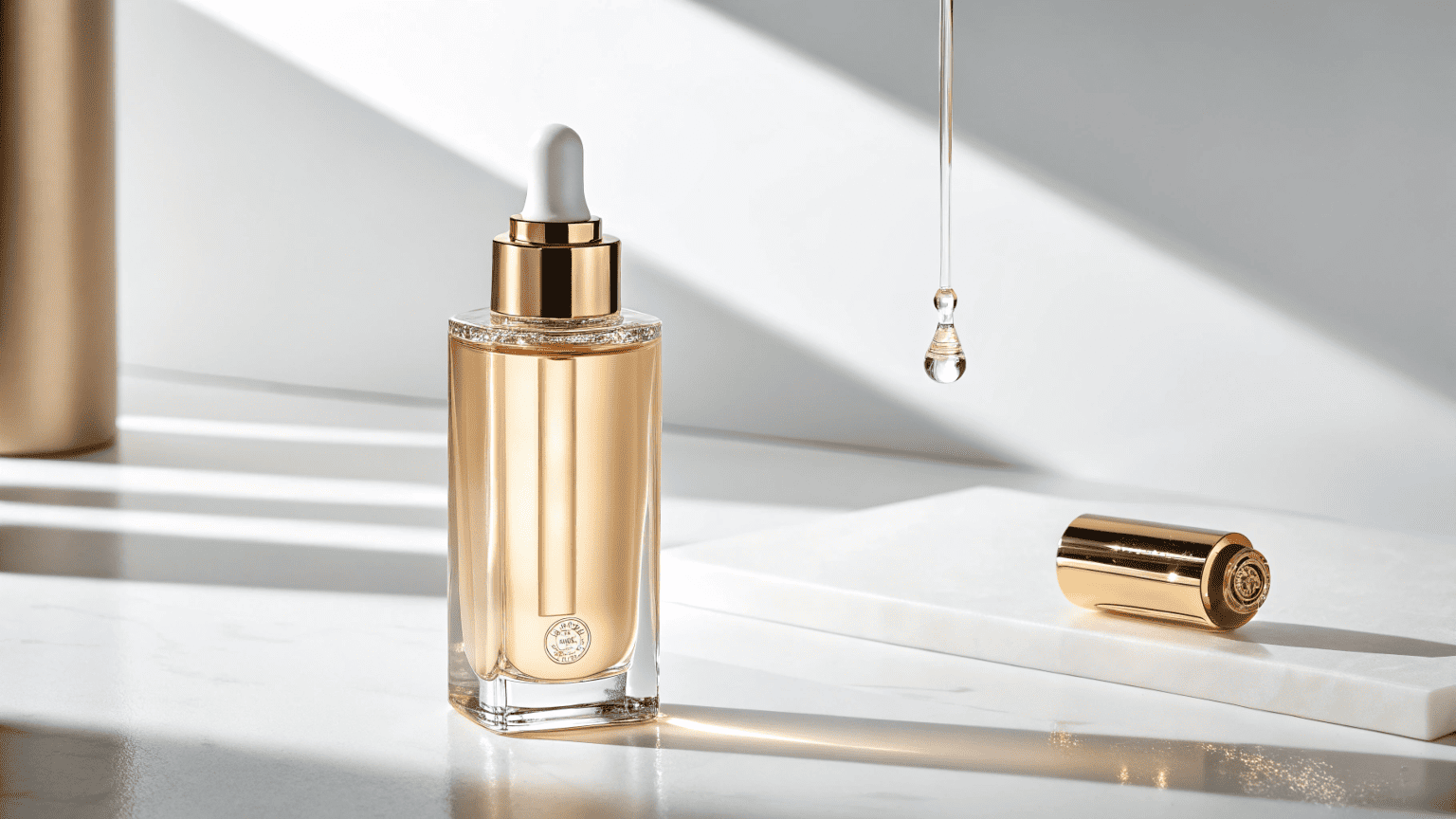
I’ve seen this happen countless times. A brand comes to us with a design they absolutely love, but it was created in a vacuum without consulting a manufacturer. We then have the difficult job of explaining that the sharp, beautiful edges they designed are nearly impossible to mold consistently or that the chosen material won't work with their formula. The best results happen when the conversation between the brand, the designer, and the manufacturer starts on day one. We know what’s possible on the factory floor. When that expertise meets a brand’s clear vision, you create a package that is both beautiful and flawless in function.
How can you balance aesthetics and functionality in design?
Your designer wants a sleek, minimalist look, but your production team says it will be too fragile to ship. You are caught in the middle, forced to sacrifice either your brand's image or the product's safety.
Achieve balance through early collaboration with your packaging supplier. Leverage their manufacturing expertise to select materials and structures that support your aesthetic vision while ensuring flawless real-world performance.

The idea that you must choose between beauty and function is a false one. You can and should have both. The secret isn't compromise; it's smart, informed design. This is where leaning on your manufacturing partner's experience is invaluable.
The Manufacturer's Role as a Design Consultant
An experienced factory is more than just a production line; it's a library of knowledge. Having produced thousands of different designs, we know what works. For instance, a brand might want a crystal-clear bottle for their new facial oil. A good supplier, like Rland, will immediately ask about the oil's ingredients. Certain oils can cause micro-cracks in some clear plastics, a phenomenon known as "crazing." We might recommend a specific grade of PETG that offers the same clarity but superior chemical resistance. This preemptive advice saves the brand from a potential product recall down the line without sacrificing the clear, clean aesthetic they wanted.
Aligning Design with Brand Identity
Your packaging's functionality should reinforce your brand's aesthetic.
- Luxury Brand: If your aesthetic is premium and exclusive, the functionality must feel the same. This means a heavy-walled jar, a smooth-action pump with a satisfying feel, and a cap that closes with a secure, quiet click.
- Clinical/Dermatological Brand: If your aesthetic is clean and scientific, the functionality should communicate precision and hygiene. An airless pump that dispenses a precise, measured dose is a perfect functional choice to support this look.
What is the difference between aesthetics and functionality?
You approve a package based on its beautiful shape and color. Later, you find out from customer complaints that the cap is hard to unscrew, making the product frustrating to use daily.
Aesthetics is how the package looks and feels—its visual and emotional appeal. Functionality is how the package performs its job—containing, protecting, and dispensing the product effectively and easily for the user.
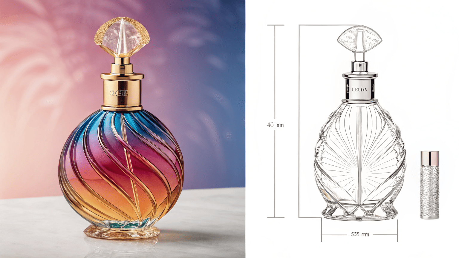
While aesthetics and functionality are different concepts, they are deeply interconnected in a successful product. One cannot be great if the other is a failure.
Aesthetics: The Emotional Connection
Aesthetics appeal to our senses and create your brand's first impression. It's the "wow" factor that makes a customer pick your product off a crowded shelf. We achieve specific aesthetics through:
- Color: Using gradient sprays or vacuum plating for a metallic sheen.
- Shape: Creating unique silhouettes with our custom mold development.
- Texture: Applying soft-touch matte finishes or glossy UV coatings.
Aesthetics communicate your brand's personality—is it fun, serious, natural, or glamorous? Recently, for a brand like RAS BEAUTY, we might develop a multi-color series where each product variant has a distinct, vibrant color, creating a beautiful and collectible aesthetic on the vanity.
Functionality: The Rational Experience
Functionality is about performance and reliability. It's the "it just works" factor that builds long-term customer trust. Key functional aspects include:
- Protection: Does it prevent leaks and preserve the formula? Our ISO 9001 quality system ensures every bottle is correctly sealed.
- Dispensing: Does the pump, dropper, or spray deliver the right amount of product without clogging?
- Ergonomics: Is the package easy and comfortable to hold and use?
A beautiful bottle that leaks is a failed product. A functional but ugly package will never get a chance to prove its reliability. Both must work in harmony.
What is aesthetics in packaging?
You think aesthetics is just about making the package "look pretty." You overlook its power to communicate value, create desire, and tell your brand's story in an instant.
Aesthetics in packaging is the art of using color, shape, texture, and visual hierarchy to create a sensory experience that communicates your brand's identity and emotionally connects with your target consumer.
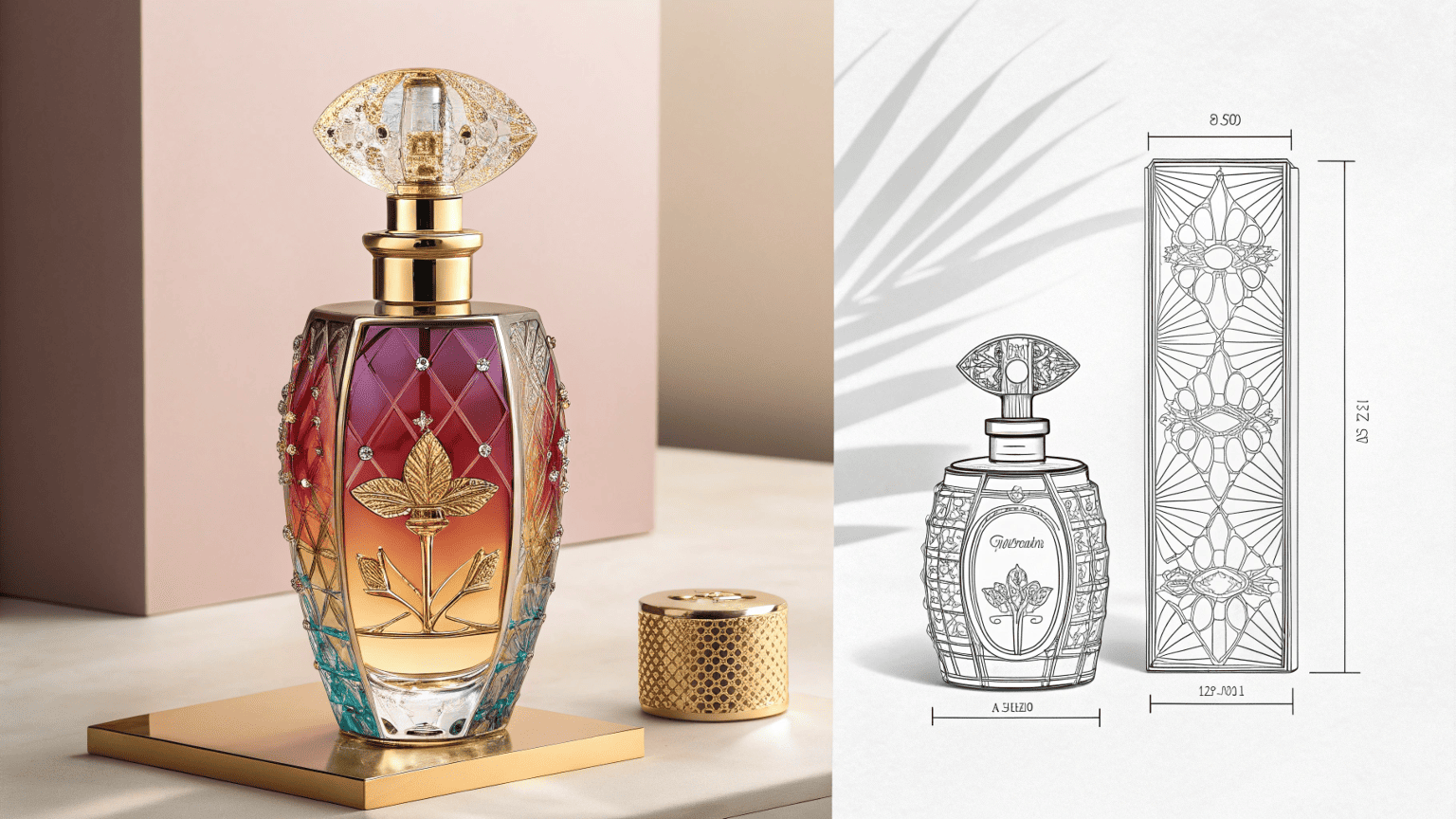
Aesthetics is a powerful business tool. It's not decoration; it's communication. It's the silent language that speaks to your customer before they read a single word on the label. When we work on a new design, we are essentially crafting this language.
Translating Brand Values into Visuals
| A brand's core identity must be reflected in its aesthetics. Let's break it down: | Brand Value | Aesthetic Execution | Rland's Capability |
|---|---|---|---|
| Natural & Organic | Soft, earthy colors; simple shapes; matte or frosted textures. | Using post-consumer recycled (PCR) materials; minimalist silk printing. | |
| Luxurious & Premium | Deep, rich colors; metallic accents; heavier weighted feel; unique shapes. | Hot stamping with gold/silver foil; high-gloss UV coating; custom mold making. | |
| Modern & Minimalist | Monochromatic color schemes (black/white); clean lines; sans-serif fonts. | Precision color matching; cylindrical and square bottle stock molds. | |
| Fun & Youthful | Bright, bold colors; playful shapes; gradient color effects. | Multi-color gradient spraying; custom color development for product families. |
By precisely defining your brand's position, you can make clear aesthetic choices. A partner like us then translates those choices into reality using advanced machinery and finishing techniques, ensuring the final product on the shelf perfectly matches the vision in your head.
Conclusion
True packaging success lies where aesthetics and functionality meet. Achieve this balance by aligning your brand's vision with your supplier's technical expertise, creating a product that is both beautiful and effortlessly usable.Grasping the Concept
I'm focused on grasping the core of "aesthetics vs. functionality." It's not just about looks versus utility; it's about making them work together. I'm exploring how to frame this in a way that feels insightful yet approachable, avoiding jargon. The challenge is in simplifying this complex design principle without losing its essence.
Finding the Right Words
I'm now in the process of formulating a concise explanation of the main topic. The "problem, agitation, solution" (PAS) framework is proving useful for structuring the introduction and secondary headlines. My goal is to make the content accessible and engaging, so I'm focusing on using simple language and relatable examples.
Crafting the Outline
I've sketched out the post's structure. The personal anecdote will lead in, setting a relatable tone. Each secondary headline will follow the PAS template, creating a consistent rhythm. The "Dive Deeper" sections will break down the concepts further, using tables and examples for clarity. I'm making sure to weave in the user's insights about manufacturer collaboration and brand alignment naturally.
Refining the Narrative
I'm now focusing on developing the "Dive Deeper" section. I'm brainstorming how to showcase Rland's expertise through a case study about a client, perhaps demonstrating how Rland's collaborative process resolved a design flaw. This will help to illustrate the importance of involving a manufacturer early in the design process. I'm also considering how to best present the "3 Cs" of packaging in a way that is both informative and memorable.
Executing the Plan
With a solid plan, I'm now writing the full draft. The introduction is complete, and I'm working through each "Dive Deeper" section. I'm using the PAS formula as a guide but allowing for a natural, conversational flow. Integrating Rland's capabilities feels smooth, framed as helpful advice rather than a hard sell. I'm confident the final piece will be both informative and aligned with the user's specified voice and format.
Written by
Mike Lee
You may also be interested in:
Why Is Sunscreen Packaging More Challenging Than Skincare Packaging?
You have a great serum in a beautiful bottle and a moisturizer in a premium
How Can You Prevent the Top 5 Sunscreen Packaging Failures?
Your sunscreen launch is at risk from hidden packaging flaws. These issues often appear post-launch,
How Do You Choose the Right Spray Output (0.12/0.18/0.25ml) for Your Product?
You're looking at supplier options and see a list of numbers: 0.12ml, 0.18ml, 0.25ml. You
What's the Best 50ml Fine Mist Spray Bottle for a Facial Mist?
Your facial mist formula is perfect, but the wrong spray bottle can deliver a harsh,